NAB conforms with The Associated Press Stylebook. The AP Stylebook is accessible online at apstylebook.com. If you have any questions, please contact the Marketing department.
Document Layout
Document General Format Guidelines
The sans serif font Arial should be used in all text applications and email correspondence. Arial was chosen for its contemporary design and wide availability. The san serif font Avenir is a secondary font that can be used on printed and styled pieces.
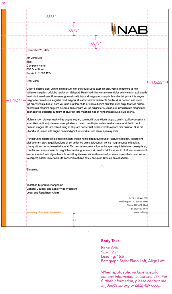
- Use 12-point Arial font for all official NAB correspondence.
- Do not use ALL CAPS in correspondence as they are difficult to read.
- For correspondence and press releases, do not indent paragraphs and leave one space between each paragraph.
- Use one space after all punctuation (a period, colon, question mark, etc.)
- Use an ampersand (&) only when it is part of a company’s formal name, never as a replacement for “and.”
- Document originators must proof the original document before proceeding with the editing process.
- Always run spell-check.
- As a rule of thumb, when it leaves your desk, the document should be thoroughly proofread and ready for publication.
- Originators must also make certain that the appropriate staff member(s) has read and edited documents prior to review by the Marketing department.
- Always use a red ballpoint pen or track changes in Word when editing. Please do not use felt tip pens, pencils or blue or black pens to edit.
- When using tabs for charts or tables, only tab once after each item. If you are sending your product to the Creative Services team, please do not format — this will automatically be done during document layout. Please discuss charts, tables and special formatting needs with the graphics team prior to submitting for layout.
- Every photo should be submitted in high resolution with a cutline with the exception of collages. Cutlines must include a brief description of the photo.
Page Layout: Letter
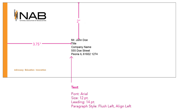
Consistency is a critical element in developing effective page layout. In addition to enhancing brand recognition, a consistent layout makes it easier for readers to identify and digest the content. For mass mailings and other personalized letters, include a five-line inside address. For bulk mailings that begin “Dear Broadcast Professional” or any other non-personalized greeting, an inside address is not necessary.
NAB Address Style
You will notice that when used in stationery and marketing pieces the NAB address contains no hyphens in the zip code or the phone and fax numbers. The exception is when you refer to the phone or fax numbers in body text you will add parenthesis and a hyphen to avoid confusion.
Envelope Layout
In addition to enhancing brand recognition through letters, the envelope should also have a consistent layout that makes it easier for readers to identify the sender and digest the content.
The address block should be (as indicated below), with the address left justified on the envelope. The address block should use NAB style of spaces, not traditional punctuation such as commas or hyphens.