NAB Spot Center Logo Usage
The NAB Spot Center logo plays off of the word “spot” with an orb in the colors of NAB Public Service as the central focus of the logo. The typeface complements the look of the main NAB logo, as well as the NAB Public Service logo.
The logo consists of type and a mark.
The following pages will provide basic guidelines for logo color usage.
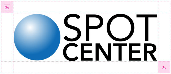
NAB Spot Center Logo Lockup
When using the logo lockup, it is important to retain the freespace standard that has been developed.
NAB Spot Center Logo Color Guide
The chart below displays the acceptable uses of color, ranked in order of preference.
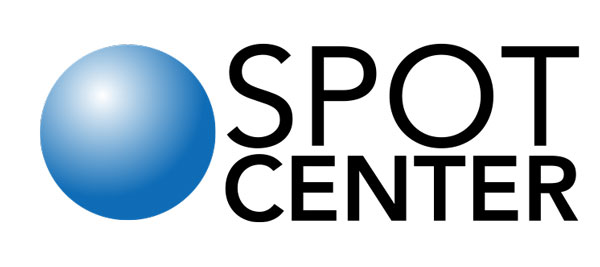
The logo has the most impact when in color. Always strive to use this version.
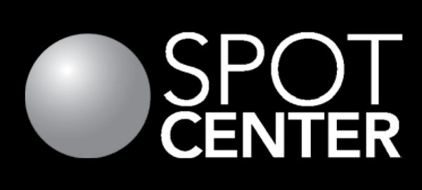
In instances where a black or dark-colored background is required, use this version.
Use if a black or 1-color logo is requested by a vendor or publication. Also may be used on fax sheets.
This logo is made of two colors, PMS 660 and Black. Depending on print and budget considerations, the PMS version should be used where possible. It should be used in large format or high-end applications. Otherwise, the CMYK version is an acceptable option.
For 2-color Jobs
PANTONE®
660 C
C: 90
M: 57
Y: 0
K: 0
R: 2
G: 108
B: 182
#036cb6
Black
C: 0
M: 0
Y: 0
K: 100
R: 0
G: 0
B: 0
#000000
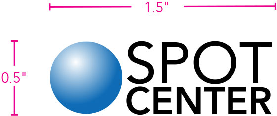
NAB Spot Center Logo Size
In order to retain legibility, the smallest the logo can appear in print is 1.5"x 0.5". This size is based on the height and width of the “NAB” in the primary parent logo.