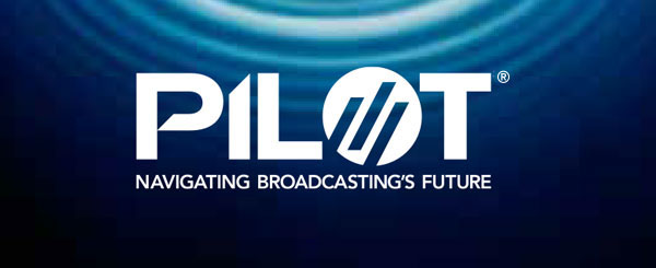
PILOT Logo Usage
The logo consists of type and a mark.
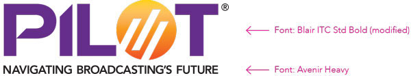
The PILOT logo incorporates the “bar” concept of the NAB logo with the use of three signals in the “O” as well as a modified mark and typeface.
The term PILOT alludes to many things, including the peak in a broadcast frequency; the spark that ignites ideas, innovation and advancement in the broadcast industry; and the partnership that is guiding and navigating broadcasting towards a vibrant future.
The PILOT logo should appear with its tagline underneath.
The following provides basic guidelines for logo color and usage.
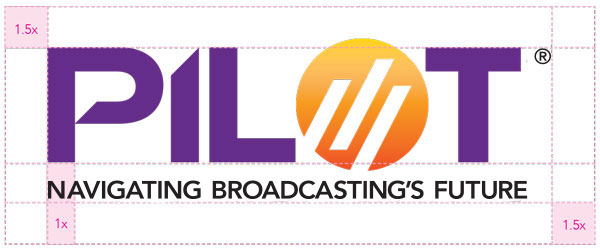
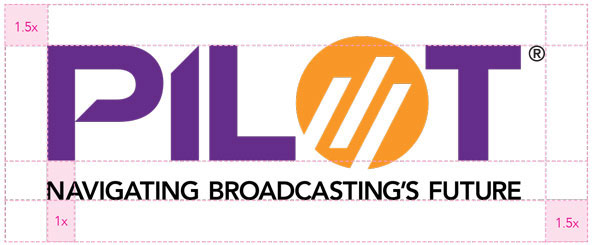
PILOT Logo Lockup
When using the logo lockup, it is important to retain the freespace standard that has been developed.
Primary Logo
Secondary Logo
PILOT Logo Color Guide
The chart below displays the acceptable uses of color, ranked in order of preference.
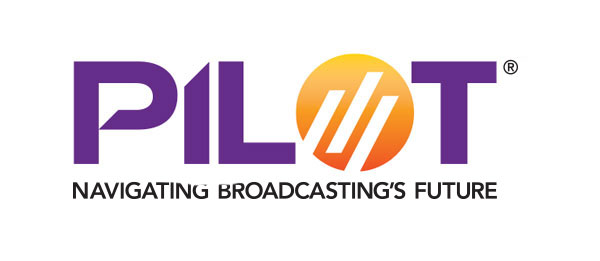
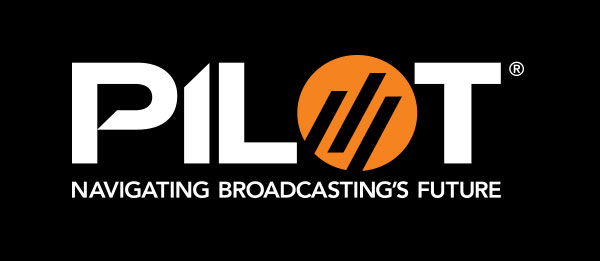
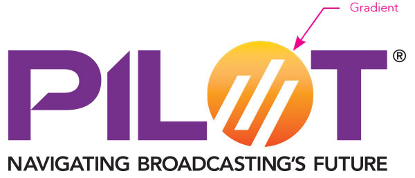
The logo has the most impact when in color. Always strive to use this version.
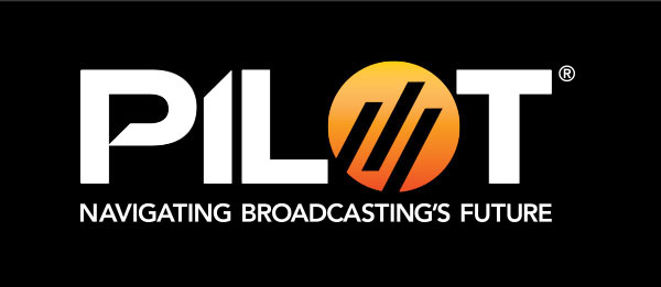
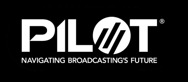
In instances where a black or dark-colored background is required, use this version.
In instances where a black or dark-colored background is required and the use of gradients is not possible, use this version.
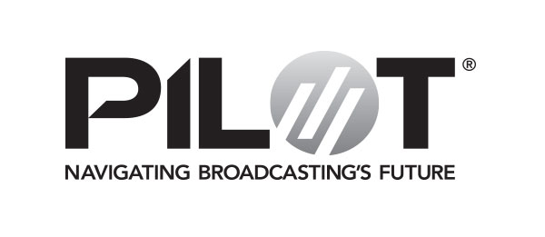
Use if a black or 1-color logo is requested by a vendor or publication.
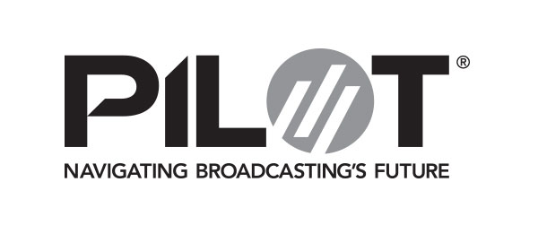
Use if a black or 1-color logo is requested by a vendor or publication and the use of gradients is not possible.
Only used if a KO (knocked out) logo is requested by a vendor or publication.
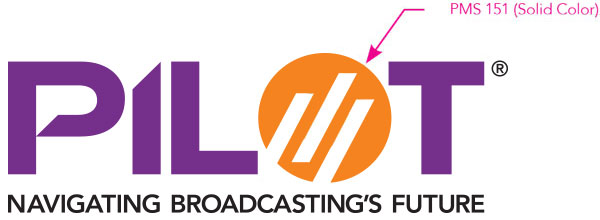
This logo is made of four colors, PMS 526, PMS 116, PMS Warm Red and Black. PMS 116 and PMS Warm Red make up the gradient in the “O” mark of the logo. Depending on print and budget considerations, the primary logo version should be used where possible. It should be used in large format or high-end applications. Otherwise, the CMYK version is an acceptable option. In cases where the two color gradient cannot be replicated the secondary logo which uses PMS 151 for the “O” mark should be used.
Primary Logo
PANTONE®
526 C
C: 76
M: 100
Y: 7
K: 0
R: 0
G: 85
B: 150
#652d89
PANTONE®
116 C
C: 0
M: 16
Y: 100
K: 0
R: 255
G: 210
B: 0
#ffd200
PANTONE®
Warm Red C
C: 0
M: 75
Y: 90
K: 0
R: 255
G: 67
B: 56
#f26531
Black
C: 0
M: 0
Y: 0
K: 100
R: 0
G: 0
B: 0
#000000
Secondary Logo
PANTONE®
151 C
C: 0
M: 48
Y: 95
K: 0
R: 248
G: 152
B: 40
#f89728
Black
C: 0
M: 0
Y: 0
K: 100
R: 0
G: 0
B: 0
#000000
PANTONE®
526 C
C: 76
M: 100
Y: 7
K: 0
R: 0
G: 85
B: 150
#652d89
PILOT Logo Size
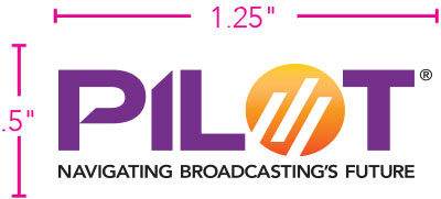
In order to retain legibility with the tagline written out, the smallest the logo can appear in print is 1.25” x .5”.
In some instances, where the logo must be very small, print restrictions may require the omission of the tagline.
PILOT Logo Usage with Imagery
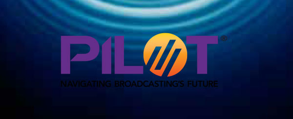
It is important to keep the logo clear and unobstructed when using it in conjunction with imagery. While placement may vary, proper contrast is vital for logo visibility. When possible, place logo over a white background.

Not enough contrast. Background too busy.

Not enough contrast. Background colors too similar to logo.

Good contrast!
Wrong logo version.

Correct logo version!
Correct logo version!
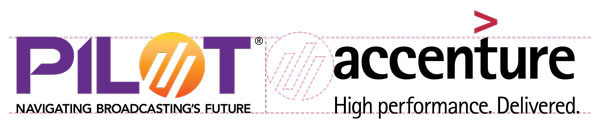
Co-Branding PILOT with Other Logos
In the event that the PILOT logo appears with other organization logos, follow the guidelines established below. Percentages are based on the area measurement of the corresponding logos.
- If PILOT is the MAIN SPONSOR, the PILOT logo should appear 50 percent larger than any co-sponsoring logos.
- If PILOT is a CO-SPONSOR, the logos should appear at equal size.
A clear space equal to the diameter of the “O” mark should separate the PILOT logo from any co-sponsors.
The PILOT logo should always be the first logo, and therefore, should be placed to the left of all other logos.
Pilot is Main Sponsor
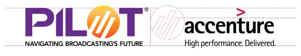
Pilot is Co-Sponsor
PILOT Primary Font
As both a verbal and visual form of communication, typography plays an essential role for providing clear communication. Good typography must be clear, legible and inviting, enabling the reader to better understand and absorb the page content. It must be flexible enough to establish a visual hierarchy for blocks of text, such as headlines, subheads and captions.
The sans serif font Arial should be used in all text applications and email correspondence. Arial was chosen for its contemporary design and wide availability. The san serif font Avenir is a secondary font that can be used on printed and styled pieces.
Arial
Arial Italic
abcdefghijklmnopqrstuvwxyz
ABCDEFGHIJKLMNOPQRSTUVWXYZ
Arial Bold
abcdefghijklmnopqrstuvwxyz
ABCDEFGHIJKLMNOPQRSTUVWXYZ
Arial Bold Italic
abcdefghijklmnopqrstuvwxyz
ABCDEFGHIJKLMNOPQRSTUVWXYZ