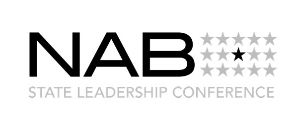
NAB State Leadership Conference Logo Usage
The NAB State Leadership Conference (SLC) logo incorporates elements of the NAB logo, including the NAB type mark and typeface. It alludes to the NAB logo through the use of five columns of stars, mirroring the five bars of the NAB. Placing the NAB type in front of the mark conveys the subordinate relationship of the program to the association.
The concept behind the logo was to highlight the patriotism and unity implicit in this event.
The logo consists of type and a mark.
The following pages will provide basic guidelines for logo color and usage.
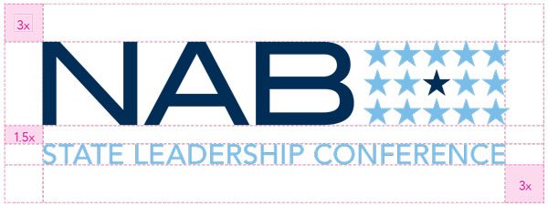
NAB SLC Logo Lockup
When using the logo lockup, it is important to retain the freespace standard that has been developed.
NAB SLC Logo Color Guide
The chart below displays the acceptable uses of color, ranked in order of preference.
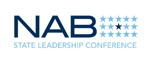
The logo has the most impact when in color. Always strive to use this version.
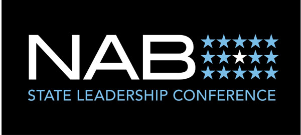
In instances where a black or dark-colored background is required, use this version.
Use if a black or 1-color logo is requested by a vendor or publication. Also may be used on fax sheets.
This logo is made of two colors, PMS 296 and PMS 292. Depending on print and budget considerations, the PMS version should be used where possible. It should be used in large format or high-end applications. Otherwise, the CMYK version is an acceptable option.
For 2-color Jobs
PANTONE®
296 C
C: 100
M: 46
Y: 0
K: 70
R: 0
G: 46
B: 86
#002d56
Pantone
292 C
C: 49
M: 11
Y: 0
K: 0
R: 121
G: 189
B: 232
#79bde8
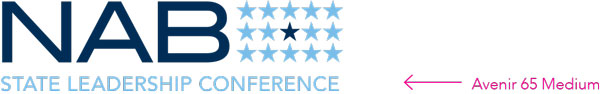
NAB SLC Logo Fonts
The secondary font (State Leadership Conference) for this logo is Avenir 65 Medium.
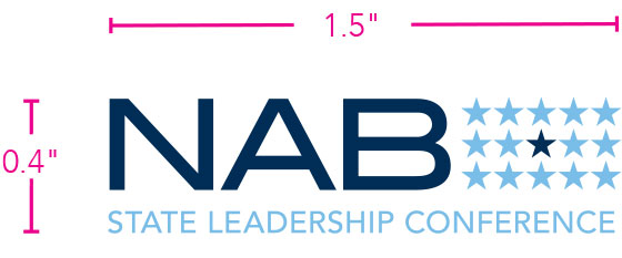
NAB SLC Logo Size
In order to retain legibility with the association name spelled out, the smallest the logo can appear in print is 1.5"x 0.4". This size is based on the height and width of the “NAB” in the primary parent logo.