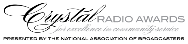
NAB Crystal Radio Awards Logo Usage
The NAB Crystal Radio Awards is a sub-brand of NAB. The logo incorporates the NAB logo, including the NAB type mark and typeface.
The following pages will provide basic guidelines for logo color usage.
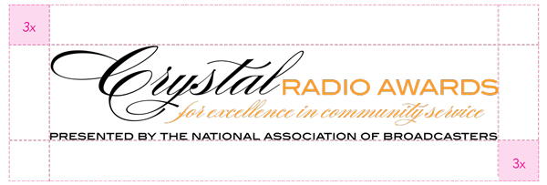
NAB Crystal Radio Awards Logo Lockup
When using the logo lockup, it is important to retain the freespace standard that has been developed.
Certain branded items (mugs, shirts, etc.) may only use the letters “NAB” with the mark and not include the full association name. This usage should be limited to instances where familiarity with the organization is ensured – such as internal or member gift items.
NAB Crystal Radio Awards Logo Color Guide
The chart below displays the acceptable uses of color, ranked in order of preference.
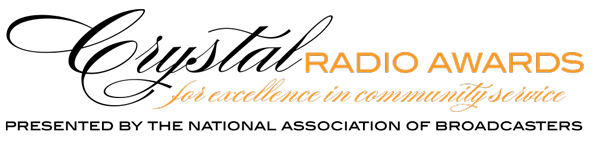
The logo has the most impact when in color. Always strive to use this version.
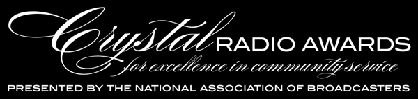
Only used if a KO (knocked out) logo is requested by a vendor or publication.
Use if a black or 1-color logo is requested by a vendor or publication. Also may be used on fax sheets.
The logo is made of two colors, PMS 151 and Black.
For 2-color Jobs
PANTONE®
151 C
C: 0
M: 48
Y: 95
K: 0
R: 248
G: 152
B: 40
#F89728
Black
C: 0
M: 0
Y: 0
K: 100
R: 0
G: 0
B: 0
#000000
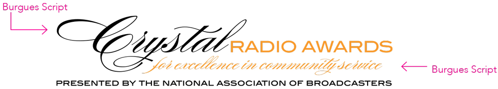
NAB Crystal Radio Awards Fonts
The secondary font (Crystal and the tag line) for this logo is Burgues Script.
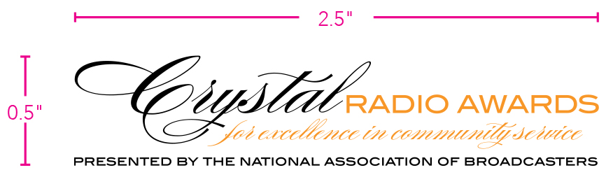
NAB Crystal Radio Awards Logo Size
In order to retain legibility with the association name spelled out, the smallest the logo can appear in print is 1.4"x 0.3". This size is based on the height and width of the “NAB” in the primary parent logo.