NAB Sales and Management Television Exchange Logo Usage
The NAB Sales and Management Television Exchange (SMTE) logo incorporates elements of the NAB logo, including the NAB type mark. Placing the NAB type in front of the mark provides a more subordinate relationship of the event to the association.
The concept behind the SMTE logo was to create a simple mark that could adapt well when placed in the context of the event’s varied themes. It harkens back to old TV station logos, but with a more modern, updated feel.
The logo usually consists of type and a mark.
The following pages will provide basic guidelines for logo color and usage.
NAB SMTE Logo Color Guide
The chart below displays the acceptable uses of color, ranked in order of preference.

Color can be applied as desired to the black portion of the logo.
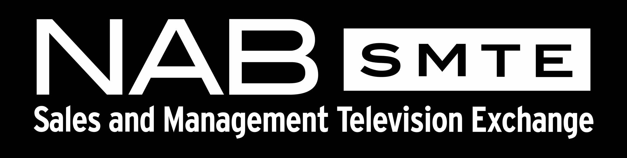
In instances where a black or dark-colored background is required and the chosen color does not contrast enough, this version can be used.
NAB SMTE Logo Secondary Font
The secondary font (Sales and Management Television Exchange) for this logo is Interstate Regular Condensed.
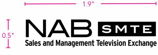
NAB SMTE Logo Size
The smallest the logo can appear in print is 1.9"x 0.5". This size is based on the height and width of the “NAB” in the primary parent logo.