NAB Leadership Foundation Logo Usage
The NAB Leadership Foundation is a “sister” brand of NAB. While they share the “bar” concept and use of the NAB type, it uses a different color, mark and secondary typeface. Placing the mark in front of the type creates a stronger individual identity for the Foundation.
Spell out “NAB Leadership Foundation” on the first mention. In subsequent mentions, use “foundation” lowercase. Using “NABLF” occasionally is fine, but the preferred name is “foundation.” If using the acronym, be sure to include it in parentheses after the first mention of “NAB Leadership Foundation.”
The concept behind the NAB Leadership Foundation logo was to alter the NAB bars to represent education and advancement.
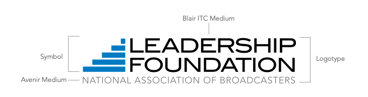
The logo consists of type and a mark.
The following pages will provide basic guidelines for logo color usage.
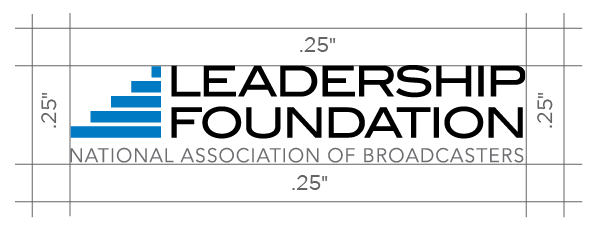
NAB Leadership Foundation Logo Lockup
When using the logo lockup, it is important to retain the freespace standard that has been developed.
NAB Leadership Foundation Logo Color Guide
The chart below displays the acceptable uses of color, ranked in order of preference.

The logo has the most impact when in color. Always strive to use this version.
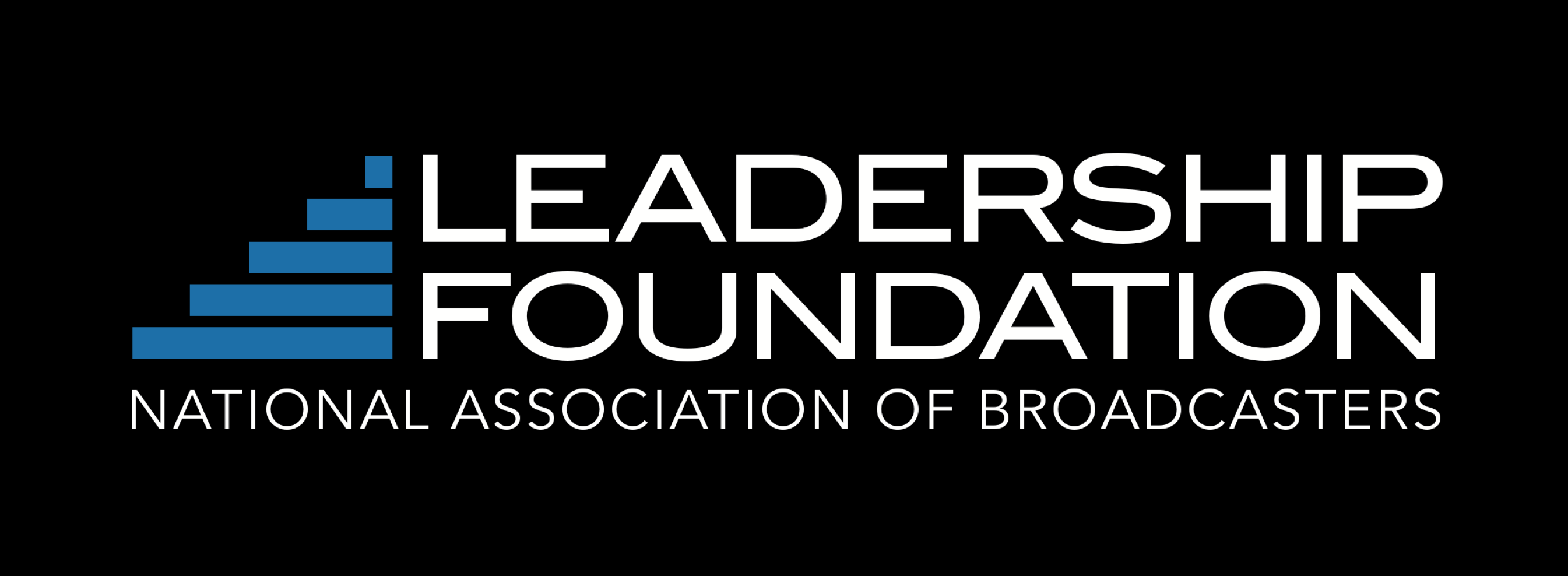
In instances where a black or dark-colored background is required, use this version.

Use if a black or 1-color logo is requested by a vendor or publication. Also may be used on fax sheets.
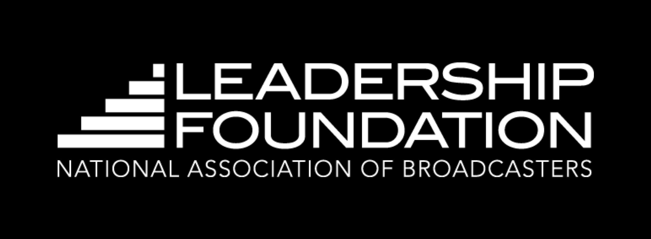
Only used if a KO (knocked out) logo is requested by a vendor or publication.
This logo is made of two colors, PMS 3005 and Black. Depending on print and budget considerations, the PMS version should be used where possible. It should be used in large format or high-end applications. Otherwise, the CMYK version is an acceptable option.
For 2-color Jobs
PANTONE®
3005 C
C: 100
M: 43
Y: 3
K: 0
R: 0
G: 120
B: 201
#0081c6
Black
C: 0
M: 0
Y: 0
K: 100
R: 0
G: 0
B: 0
#000000
NAB Leadership Foundation Logo Fonts
The secondary font (Leadership Foundation) for this logo is Avenir Medium.
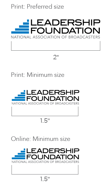
NAB Leadership Foundation Logo Size
In order to retain legibility with the association name spelled out, the smallest the logo can appear in print is 1.5". This size is based on the height and width of the “NAB” in the primary parent logo.