NAB Futures Logo Usage
The Futures logo reflects the event’s focus on next-generation and disruptive technology. Its distinctive magenta-to-purple gradient establishes Futures as a unique NAB event, with its own content and audience. At the same time, the Blair typeface used as the foundation for the design creates a visual connection to NAB PILOT and the broader NAB brand, reinforcing Futures as part of the larger NAB brand family.
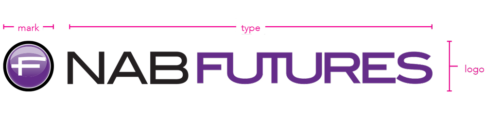
NAB Futures Logo Lockup
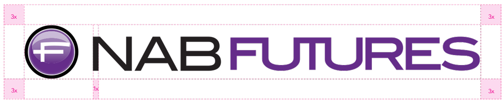
When using the logo lockup, it is important to retain the free space standard that has been developed.
NAB Futures Logo Color Guide
The chart below displays the acceptable uses of color, ranked in order of preference.

The logo has the most impact when in color. Always strive to use this version.

Use if a one-color logo is requested by a vendor or publication when gradients are not possible.

Use if a black logo is requested by a vendor or publication and screen tints are possible. Also may be used on fax sheets.

Use if a black logo is requested by a vendor or publication and screen tints are not possible. Also may be used on fax sheets.

Only use if a knocked out (KO) logo is requested by a vendor or publication.
This logo is made of two colors, PMS 806 C and PMS 526 Purple. Depending on print and budget considerations, the PMS version should be used where possible. It should be used in large format or high-end applications. Otherwise, the CMYK version is an acceptable option.
For Two-color Jobs
PANTONE®
PMS 806 C
C: 0
M: 91
Y: 0
K: 0
R: 225
G: 62
B: 181
#FF3EB5
PANTONE®
526 C
C: 76
M: 100
Y: 7
K: 0
R: 101
G: 45
B: 137
#652D89
NAB Futures Logo Size
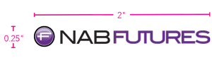
In order to remain legible, the logo should not appear smaller than 3.5" × 0.25" in print.